
As I’ve promised in my previous blog, I will share in this blog my experience applying K-means clustering to some tasks in my workplace. K-means is a form of unsupervised machine learning. Let me explain what supervised machine learning and unsupervised machine learning are. In supervised machine learning, you are given a set of inputs and outputs and you try to use these data to predict what is going to be the output sometime in the future. Some regression and classification algorithms belong to supervised machine learning because you already have values for some independent variables and dependent variable and you are trying to forecast the value of the dependent variable at some point in time. On the contrary, you do not have the input provided in unsupervised machine learning. What you have is a set of output and from these output you try to group them into different clusters with similar characteristics in each cluster. Ideally, each cluster would have similar number of observations.
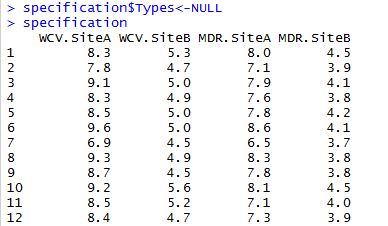
In my current job with a Bay Area pharmaceutical company, my daily tasks involve performing statistical process control analysis and continue process verification on pharmaceutical manufacturing data, ranging from water content value to average weight of coated tablets. While the data I pulled from the database are always classified into different groups already, the fact that I have gained knowledge in clustering algorithm through Professor Andrew Ng’s online Machine Learning course on Coursera heightened my curiosity to test machine learning methods on my dataset. The results were promising. I was able to use K-means clustering to group a given set of water content values and metal detection reject data into groups that closely match grouping in the original dataset! Having said that, I won’t use the actual dataset for demonstration here due to confidentiality. I have revised my data slightly while preserving a similar structure as the original observations. The dataset called “spec” is attached below.
There are 150 records in this dataset, with 4 attributes in each record. The 4 attributes are numeric variables and they are Water Content Value at site A, Water Content Value at site B, Metal Detection Rejects at site A and Metal Detection Rejects at site B. The “Types” variable is categorical and are classified into low, medium or high specification. The attributes (columns) are abbreviated as following, where WCV and MDR stands for Water Content Value and Metal Detection Rejects, respectively:
| WCV.SiteA | WCV.SiteB | MDR.SiteA | MDR.SiteB | Types |
Before we can start testing K-Means cluster algorithm, we have to replicate the original dataset sans the Types column since we want to know if the algorithm is able to classify data into 3 groups like the original dataset. The dataset is called “specification”, so we set the Types column to NULL. The R code as well as a small portion of the resulted dataset is shown below:
Now that we have a new dataset where all variables are numeric, we can standardize its scale so that data can be comparable. This won’t change values of the dataset. It simply stretches or narrows the y-axis scale if data are not already comparable. The resulted dataset will be saved as “scaledata” in R:
>scaledata<-scale(specification)
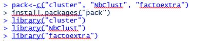
Now we must determine the optimal number of clusters. For this I want to thank STHDA.com (Statistical Tools for High-throughput Data Analysis) for displaying some useful packages for this analysis. Let’s proceed:
We first have to install the aforementioned R packages and load them by calling out their libraries:
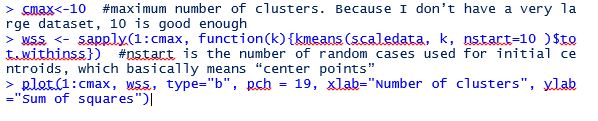
Next we run the following codes to plot the “elbow” chart to determine where is the elbow point (that is where the absolute value of the slope of the line first start to flatten):
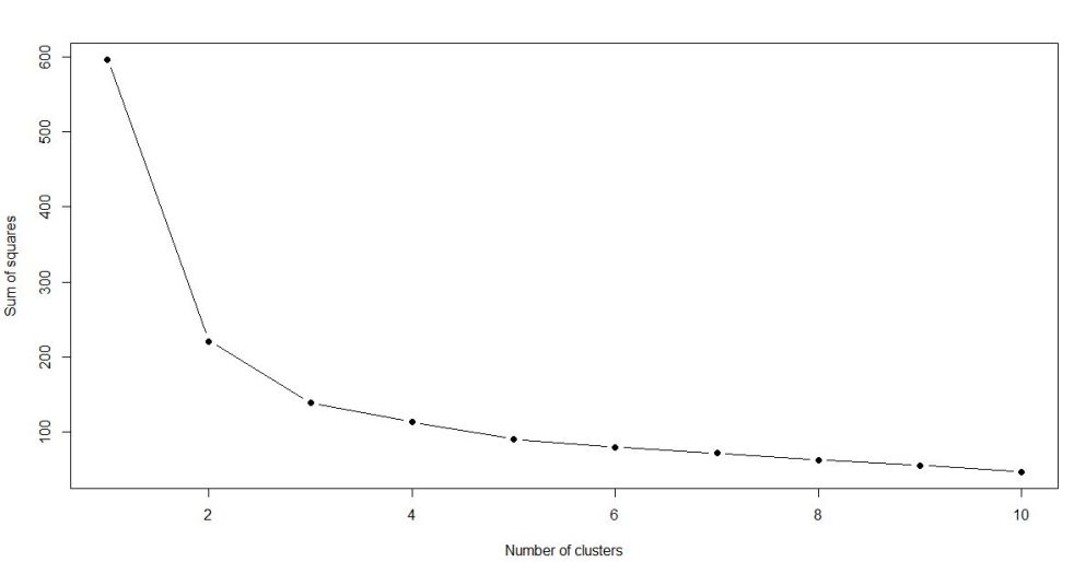
As you can see from the elbow chart, the slope (in absolute value) of the line first starts to flatten when number of clusters equals 3. That means the number of clusters that can be divided into from the dataset will be 3.
We can now start classifying observations into the 3 clusters and save the outcome into “results”:
>results<-kmeans(scaledata,3)
>results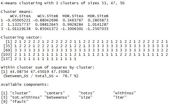
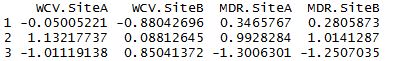
>results$centers
Next we can see how K-means clustering compares to real results:
>table(original$Types,results$cluster)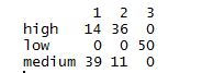
From this table we can see that “low” has 50 observations in the original dataset, and that they’ve all been grouped into cluster 3. (Notice the cluster 3 clolumn doesn’t have any other number above or underneath 50. That means no other data points from “low” have been mistakenly grouped into “high” or “medium”.) So cluster 3 is perfectly classified! For “high” and “medium”, each has 50 observations in the original dataset. However, clusters 1 and 2 are slightly off as we have 53 in cluster 1 and 47 in cluster 2 (still very close to perfect).
Now we can visually see the groupings of water content values and metal detection rejects for both the undisturbed dataset and the new dataset using K-means clustering:
>plot(original[c("WCV.SiteA","WCV.SiteB")],col=results$cluster)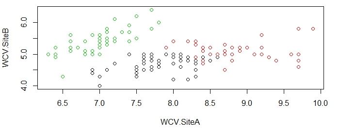
>plot(original[c("WCV.SiteA","WCV.SiteB")],col=original$Types)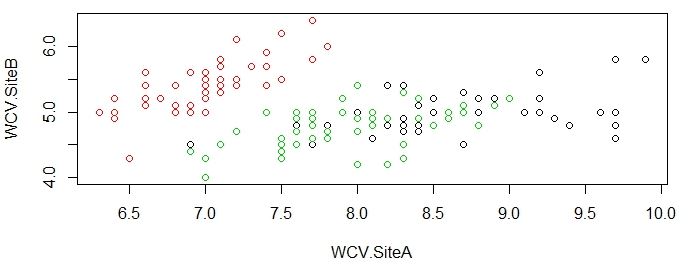
>plot(original[c("MDR.SiteA","MDR.SiteB")],col=results$cluster)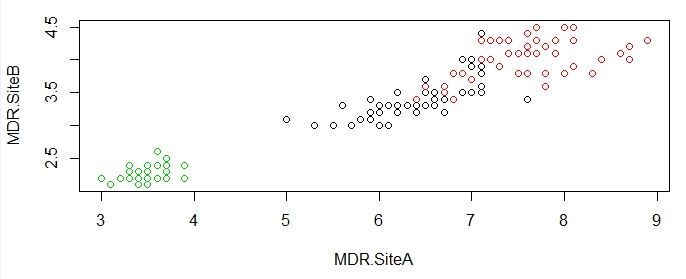
>plot(original[c("MDR.SiteA","MDR.SiteB")],col=original$Types)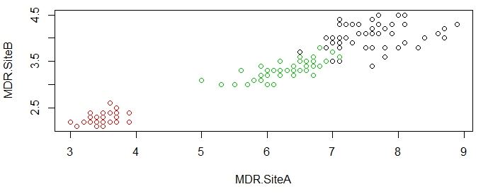
As you can see from the charts above, the groupings done by K-means algorithm is very close to actual data, which is impressive given that R was able to produce this satisfying results without much instruction.
The exact same algorithm can be performed in SAS as well, albeit with a little more complicated codes. Below is the list of SAS codes to arrive at the elbow curve:
PROC IMPORT OUT= cluster DATAFILE= “/folders/myfolders/spec.csv”
DBMS=csv replace;
run;
proc standard data=cluster out=scalecluster mean=0 std=1;
var WCV_SiteA WCV_SiteB MDR_SiteA MDR_SiteB;
run;
%macro kmean(K);
proc fastclus data=scalecluster out=outdata&K. outstat=cluststat&K. maxclusters= &K.;
var WCV_SiteA WCV_SiteB MDR_SiteA MDR_SiteB;
run;
%mend;
%kmean(1);
%kmean(2);
%kmean(3);
%kmean(4);
%kmean(5);
%kmean(6);
%kmean(7);
%kmean(8);
%kmean(9);
%kmean(10);
data clus1;
set cluststat1;
nclust=1;
if _type_=’RSQ’;
keep nclust over_all;
run;
data clus2;
set cluststat2;
nclust=2;
if _type_=’RSQ’;
keep nclust over_all;
run;
data clus3;
set cluststat3;
nclust=3;
if _type_=’RSQ’;
keep nclust over_all;
run;
data clus4;
set cluststat4;
nclust=4;
if _type_=’RSQ’;
keep nclust over_all;
run;
data clus5;
set cluststat5;
nclust=5;
if _type_=’RSQ’;
keep nclust over_all;
run;
data clus6;
set cluststat6;
nclust=6;
if _type_=’RSQ’;
keep nclust over_all;
run;
data clus7;
set cluststat7;
nclust=7;
if _type_=’RSQ’;
keep nclust over_all;
run;
data clus8;
set cluststat8;
nclust=8;
if _type_=’RSQ’;
keep nclust over_all;
run;
data clus9;
set cluststat9;
nclust=9;
if _type_=’RSQ’;
keep nclust over_all;
run;
data clus10;
set cluststat10;
nclust=10;
if _type_=’RSQ’;
keep nclust over_all;
run;
data clusrsquare;
set clus1 clus2 clus3 clus4 clus5 clus6 clus7 clus8 clus9 clus10;
run;
proc sgplot data=clusrsquare;
series x=nclust y=over_all;
run;
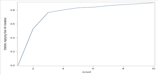
Notice I have specified 10 maximum clusters in my codes. This is the same number I specified in R so everything is consistent between R and SAS. You will get a lot of statistics after running these codes, including the standard deviation of each of the 10 clusters. But the part that’s most important is the elbow curve, which I am showing below. As you can see, SAS returned an upward-sloping elbow curve instead of the downward-sloping curve returned by R. This is due to the default method SAS uses for elbow curve: plotting the overall R-squares on the y-axis as opposed to sum of R-squares in R. Having said that, the magnitude and slopes of each point is the same as the chart generated by R. The elbow point occurs when number of cluster equals 3, which is same as the result in R.
Since we know the number of optimal clusters is 3, we can revise the SAS “fastclus” code by specifying maxc (maximum number of clusters) as 3:
proc fastclus data=scalecluster maxc=3 out=finalclus;
var WCV_SiteA WCV_SiteB MDR_SiteA MDR_SiteB;;
run;
We will then get the following classification table which shows the allocation of observations into the 3 clusters. 50 observations are put into 1 cluster, 53 into another cluster, and 47 into the third cluster. The clustering split is exactly the same as results we got from R.
| Cluster Summary | ||||||
| Cluster | Frequency | RMS Std Deviation | Maximum Distance from Seed to Observation |
Radius Exceeded |
Nearest Cluster | Distance Between Cluster Centroids |
| 1 | 50 | 0.5148 | 2.1026 | 2 | 1.8601 | |
| 2 | 53 | 0.4887 | 2.6405 | 1 | 1.8601 | |
| 3 | 47 | 0.4571 | 2.1450 | 2 | 2.9774 | |
One takeaway from this R and SAS comparison is that: although SAS is widely-used in statistical analysis, its syntax might not be as efficient and straightforward as R under certain circumstances. For example, there’s no simple code to generate elbow chart in SAS. You first have to write a SAS macro to generate R-squares for all 10 clusters. At the same time, you also have to assign old datasets into new datasets time after time. The same elbow chart can be generated in R with only 8 lines of codes!
Finally, we can also visualize the clustering chart in the form of a dendrogram, which is similar to a tree diagram and shows the groupings of similar clusters. The R codes to run dendrogram is as follows:
>nsd<-dist(as.matrix(scaledata))
>den<-hclust(nsd)
>plot(den)
We then arrive at the following diagram:
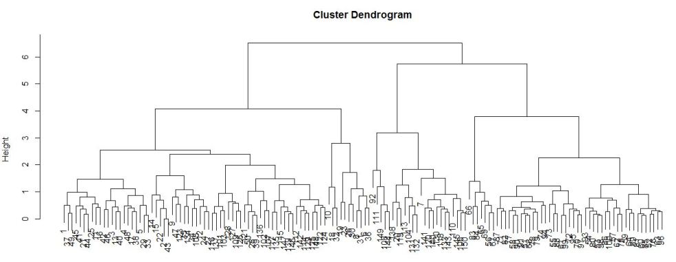
It is not a very good representation in this case. This is because the ID variable (first column of the dataset that shows the number of the observation) is in numeric instead of categorical form and those are represented by the small clustered numbers at the bottom of the diagram. Although the numbers are hard to see, you can see there are 3 subgroups within each of the 2 major nodes. I am still new to dendrogram, but if I have to make an educated guess, I would think those subgroups are “low”, “medium” and “high”, the 3 spec types in the dataset. Once I’ve gained more knowledge in dendrogram, I will come back and update this section of the article.
I am excited that I was able to perform a simple machine learning algorithm for the first time, with real world data. The first time I heard of machine learning in a data science forum I thought I would never be able to utilize it unless I have a highly advanced degree. But thanks to the useful dataset I was presented in my current job as well as the Machine Learning online Coursera class I took, I have exceeded the expectation I had on myself. Of course, there are a lot more to machine learning algorithms than K-means clustering, and I am ready to take my understanding to the next level and explore more of machine learning in the real world. Stay tuned as I will share any new discoveries I may coming across!

This is a nice machine learning data analysis skill post! I got very comprehensive knowledge about how to perform K-Means clustering using different data analytical programs. Also, really appreciate your realistic working experience sharing. Looking forward to the next amazing update. 🙂
LikeLiked by 1 person
Thank you for your warm feedback. I will take your words and keep up the efforts. I will be adding a new blog very soon about statistical process control using R. Please stay tuned. 🙂
LikeLiked by 1 person